The financial market is a world filled with symbols and charts, a realm where mastering the art of reading these coded messages can mean the difference between profit and loss. Today, we delve into one of the most influential techniques in technical analysis: the candlestick chart. The key to unlocking its potential? Knowing how to read candlesticks accurately and effectively.
An Overview of Candlestick Charts
Candlestick charts originated in 17th-century Japan when rice trader Homma Munehisa realized that emotions significantly influenced the price of rice. Fast-forward several centuries, and we find these charts invaluable to traders across the globe.
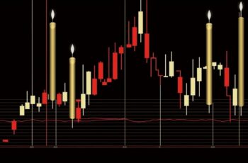
Candlesticks are rectangular shapes that represent specific time periods, such as one day, one hour, or even one minute (1). Each “candlestick” displays four main data points: the opening price, closing price, highest price, and lowest price during that period.
(1) https://www.investopedia.com/terms/c/candlestick.asp
The body of the candlestick (the rectangular part) represents the opening and closing prices. If the body is filled (usually colored), the asset closed lower than its opening price, indicating a bearish trend. Conversely, if the body is empty (or a different color), the asset closed higher, suggesting a bullish trend.
The “wicks” or “shadows” — thin lines above and below the body — represent the highest and lowest prices during the same period. The length of these wicks can provide clues about market sentiment.
The Language of Patterns
Learning to interpret candlestick patterns is akin to learning a new language. Here are some of the most common patterns:
- Doji: This pattern signifies indecision in the market. The opening and closing prices are almost equal, and the body appears as a thin line.
- Hammer and Hanging Man: Both have small bodies and long lower wicks, but they appear under different circumstances. A Hammer signals a potential price reversal during a downtrend, while the Hanging Man may indicate a possible downturn during an uptrend.
- Bullish and Bearish Engulfing: These patterns consist of two candlesticks. The second candlestick ‘engulfs’ the body of the first, indicating a possible trend reversal.
Candlestick Analysis in Practice
Let’s look at an example. In February 2020, the S&P 500 index chart exhibited a Bearish Engulfing pattern, followed by a significant market downturn due to pandemic fears (2). Traders who recognized this pattern might have been able to minimize their losses or even profit from short-selling.
(2) https://www.macrotrends.net/2324/sp-500-historical-chart-data
Limitations and Complementary Tools
While candlestick patterns can provide valuable insight into market sentiment, they shouldn’t be used in isolation. Other technical analysis tools such as trend lines, volume indicators, and Moving Average Convergence Divergence (MACD) often complement candlestick analysis, leading to more robust trading decisions.
Additionally, fundamental analysis — considering factors like economic indicators, industry trends, and company financials — is crucial for a comprehensive investment strategy.
Conclusion
With their rich history and utility, candlestick charts are an integral part of modern technical analysis. Learning to decipher their patterns could be a game-changer in your trading journey. Remember, practice is paramount, and no single tool should dictate your trading decisions. Happy trading!